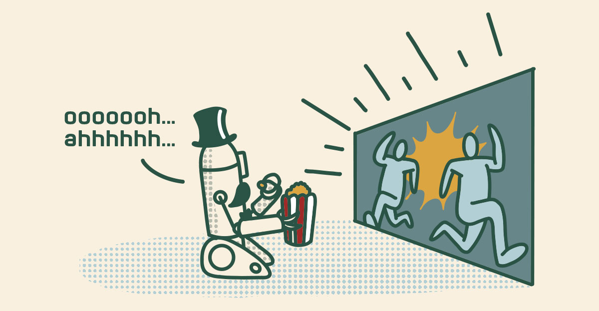
Michael Bay's filmography on Rotten Tomatoes is a long list of movies categorized as rotten by both critics and audiences. If you've watched one of his movies, you'll quickly realize that he substitutes spectacular visual effects for plot or character development. The thirty-second trailer looks amazing, but the movie length barrage of explosions and one-liners is boring. All the flash can't compensate for the weak story. This is the problem with video backgrounds and similar animated effects on websites.

Most organizations we work with want their website to be intuitive and easy-to-use, but how do you actually accomplish that in a design?
There are two strategies to make a tool intuitive:
- Match experience
- Remove choices
Match Experience
Imagine that you bought a new car and when you went to drive it off the lot you discovered that the gas pedal raised and lowered the windows. That was my experience when I first drove a swather. If you didn't grow up on a farm like I did, a swather is an enormous lawnmower that chops alfalfa into long rows. To operate a swather, you shift it into gear and then accelerate using two hand controls by the seat. In place of the gas pedal is a pedal that raises and lowers the cutting teeth of the machine. Because it didn't match my other experiences, it took a lot of mental energy to drive it those first couple of times with the teeth bouncing up and down whenever my foot instinctively reached for the "gas."
On a desktop, almost every website places their primary navigation at the top of the page. While it might be creative to shift the navigation to an alternate placement, it adds a cognitive obstacle to users because it doesn't align with their experience. It's great to be creative with how we display information on a website, but in terms of the function of the site, you want it to be boringly conventional.

I have a friend, Mike, who is a part-time lawyer and part-time university professor. He loves teaching and he has often told me he would happily stop "lawyering" and teach full- time if he could.
"Why don't you?" I asked him the first time he mentioned this.
"Because I have a JD (jurors doctorate) and not a PhD. Everyone else in the department is a PhD. The school keeps me around because they can tell prospective students they have a practicing lawyer on staff," Mike told me.
What does Mike have to do with you?
Associations used to be private repositories of knowledge where access to information was a benefit of membership. With the rise of bloggers and podcasters you increasingly had to compete for members' attention as knowledge became less scarce. Artificial intelligence is making knowledge even less scarce because anyone can generate content on any subject. If members were drowning in content before, they're soon going to be sitting on the bottom of the ocean.
If you're like most associations, AI seems like a boon that can serve your constrained staff and budget. And it can be. But keep in mind that *everyone* now has access to this tool. If you over-rely on it to generate content you will devalue your organization as you become indistinguishable from the new standard.
This Halloween, I'm heading down to New Orleans for a vampire themed costume ball. While I was doing research on where I might go and what I might attend, I realized that I could use ChatGPT to help. I quickly generated information on exactly what I was looking for.
This poses a problem for many content creators, including your association.
We've been trained to use search engines to interact with the Internet. Search has been a win-win game for users and content creators. If someone, like your association, creates content that delivers value, they gain the attention of users.
For example, if I search Google for a list of Halloween Balls, I will end up on the websites of the people who have created the most value around providing information on Halloween balls. Google wins, the content creators win, and I win. There's an entire digital marketing field built on this mechanism called search engine optimization (SEO.)
Artificial intelligence upends this formula. AI's like ChatGPT are trained on publicly available information: books, social media, articles, and *your* website. When ChatGPT processes this data to create a response to a query, it doesn't say, "Read more about this on this association's website." It just provides an answer.
In the new world, ChatGPT wins and the user wins, but content creators, like your association, are cut out of the deal.
There's a famous mansion in San Jose, California called the Winchester Mystery House. The legend is that Sarah Winchester, heiress to the Winchester Rifles fortune, was haunted by the ghosts of people killed by the rifles. She saw a psychic who told her that she had to build a house for the ghosts and she could never stop building it or they'd kill her. The mansion was under construction for thirty-two years and contains doors that go nowhere, stairs that vanish into the ceiling, and other architectural oddities.
That's the legend. The reality is that Sarah Winchester had an interest in architecture and a bottomless budget and built things that caught her fancy rather than that fulfilled a specific function.
What belongs on an association website's homepage? It's the most important page on your site because it's the most visited page. The challenge is determining what you should say, how much information you should provide, and what the order that information should be displayed in. It's Tetris for experience design. Your organization is unique and has unique requirements, but in this article I'll provide some guidelines on how to approach these challenges in laying out your homepage.
The 2019 Marketing General Membership Marketing & Benchmarking report has a section on internal challenges to membership.
The #3 largest internal challenge is “Difficulty in proving ROI.”
“How do we prove return on investment,” is not a great question for improving retention.
After a presentation, an executive approached me with an internal argument her staff was having. She said that they were going back and forth over whether they should make all of the content on their website freely available or whether they should put it behind a membership "wall" so that only members could access it? She wanted to know which option I advocated?
Should your association website have content speaking to your member’s customers?
As an example, if you’re an association of landscape professionals, should you write articles on lawn management or have a big button, “Find a Landscape Professional?”