What belongs on an association website's homepage? It's the most important page on your site because it's the most visited page. The challenge is determining what you should say, how much information you should provide, and what the order that information should be displayed in. It's Tetris for experience design. Your organization is unique and has unique requirements, but in this article I'll provide some guidelines on how to approach these challenges in laying out your homepage.
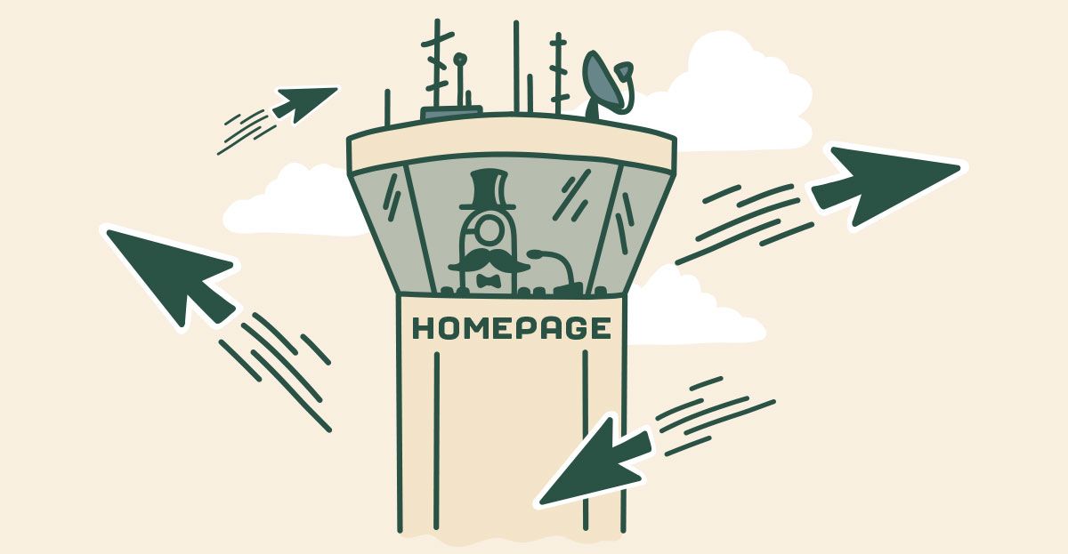
The Homepage is The Air Traffic Control Tower
Your association website is not a sales oriented website or an e-commerce store. Instead it's closer to a portal. You might not be familiar with this term, but back when I was a tween we had web portals like Compuserve, America Online, and Yahoo (and still do.) Web browsers used to start with a portal loading as the default page because portals bring disparate feeds of information into a single point to begin a navigation journey. Like a web portal, association websites are information dense and serve visitors with a wide variety of goals.
The job of the homepage is to:
- First deliver your value proposition.
- Then direct your visitors to the best resource for their goals.
Think of your homepage like an air traffic control tower and your visitors like the planes waiting to leave the terminal. Once they know why you matter (value prop), its job is to put them on the runway to their destination.
Start With Your Value Proposition
Why should your homepage start with your value proposition?
This is for a couple of reasons:
- Associations often struggle to articulate their value. The homepage provides high visibility real estate for you to make your case.
- Your visitors need to know why you matter. They need to know that they're in the right place and you have something that interests them.
Your value prop should be in just a couple of possible locations on the page. Either it should be a tagline in your navigation or it should be organized into a headline and sub-headline at the top of the page.
Many value propositions are verbose and loaded with language that you understand, but a stranger wouldn't. For a public facing asset like your site, it should instead be distilled into an elevator pitch: memorable, short, and easy to comprehend. What's your role in their world?
Next in priority are the following elements...
Highlight Campaigns
There are always new developments in communal organizations. I'll loosely term these, "campaigns," but they're not restricted to marketing campaigns. What campaigns share in common is that there's activity across some arc of time and that because they're time limited, you want to highlight them in your communications.
For example:
- Conferences
- Workshops
- Advocacy
- Awareness or marketing campaigns
They're not always going to be important, but you want to ensure that people see them for some length of time.
Pitch Membership
If you're member driven, there should be some form of short form membership pitch on your homepage. It's the 50,000 foot view of how you help members with a link through to member benefits.
Direct To Areas of Interest
There are probably less than five areas on your website that contribute to most visitor interest. Whatever areas or pages these are, you should provide a visible and easy means to navigate to them. For example:
- Member resources
- Forum
- Knowledge base
- Upcoming workshops
- News on your big conference
- etc
CTA
A call to action (CTA) is a good way to end any page, including your home page. That might be a lead magnet that's proven effective for non-members or a link to some other entry point into your organization, like an event page.
These Are the Ingredients
Yesterday, I brought our team together for an AirBnB experience making sangria with a Spanish cook. She told us that sangria is different town to town because it's less a specific drink and more a method of making a drink. You could use white, red, rose, or bubbly wine as the base. You could change the liquors or spices used to flavor it or the fruit the mixture steeps in. What makes it sangria is that you're bringing these elements together in a common pattern of preparation. Similarly, your homepage is likely going to reflect your unique mixture, but these are the main ingredients to mix there.