If you’re like most association staff, you don’t have enough hours in the day and you’re almost hamstrung with a lack of budget.
But you know you could be doing a better job selling the value of your association... If only you had more time and money! Catch-22! Darn it!
Here’s the thing:
You don’t need hours of effort and you don’t have to break open your piggy bank. If you’ve got just five minutes to spend boosting recruitment, I’ll reveal five easy changes to transform your current member benefits page into a more effective pitch.
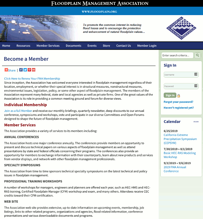
Following the 5 fixes below is a screencast showing how it looks in action and before and after screenshots from an association website.
1) Call Out to Potential Members Using Social Proof in Your Headline
Your association has a key psychological driver of persuasion: social proof.
Social proof is where people are more apt to believe the value of something or the truth of a statement, simply because other people do. It’s the herd instinct within us.
An easy tactic to improve your member benefits page headline is to couple this social proof with a call out to your prospective members.
By addressing potential members on the page, you’re increasing the relevance to them and the persuasiveness of the statement. Use this tactic in place of a vanilla, “Member Benefits” headline on your page.
If you don’t think your membership numbers sound impressive or authoritative, you can use ratios and percentages.
It looks like this:
- “Join Over 7,000 Fellow Peace Officers, Prosecutors, and Law Enforcement Personnel”
- “3 out of 4 California City Planners are Members, Find Out Why”
- “Join the Community of Electrical Engineers That Represent 76% of Texas Independent Firms”
Then follow your headline with a simple clarification sub-headline “Membership Benefits”.
2) Remove “About Us” Text and Lead With “You”.
It’s tempting to explain who you are and why you matter to potential members. This is a mistake.
It’s safe to assume that anyone at the stage of reading about your membership benefits knows who you are. What they’re trying to figure out when they’re on this page is whether they’ll serve their own interests by joining.
Your headline should have captured their attention. Once you have it, you need to immediately begin speaking to their interests and desires.
Rather than have your first paragraph start with, “The Society of X provides...”
Say, “You...” or “You’ll get” or “You want...” or “You face this every day and this is how you’ll get help by being a member.”
3) Use the “3 CTA 3” Structure to Make it Readable.
Your brain needs cues to process information. It’s why books have chapters, filled with paragraphs, filled with discrete cues like capital letters, periods, and commas.
Your offer is no different.
Don’t feed your readers walls of text or long paragraphs.
Break your benefits up into groups of three and separate them with calls to action.
- Benefit
- Benefit
- Benefit
Join Now Button
- Benefit
- Benefit
- Benefit
Join Now Button
This will make it both easier for potential members to understand and process what you’re communicating, but will give them multiple hooks to take them to the next step: signing up.
4) Use All Caps, Underline, and Bold on Your “Join Now” Links
Many association websites don’t use buttons on their member benefits page. This is a missed opportunity, but not something you can solve in 5 minutes.
If all you have are text links on your offer page, use this trick to make them stand out: simply make the link all caps, all bold, underlined and put it on it’s own line.
Instead of:
“Individual Membership: Click here to apply online and join the EMA today!”
Say:
“JOIN NOW”
5) Position Your Member Benefits Page to Capture Attention
There is a psychological reaction known as the “Serial Positioning Effect”. The Serial Positioning Effect states that a person’s attention tends to be drawn to the first and last items in horizontal lists, like menus, and the top and bottom item in vertical lists, like drop down menus.
Because of this, if your Member Benefits page is listed in a main menu, you should seriously consider having it last in the menu items.
If it’s in a drop down menu, like “Member Resources,” it should be either first or last in that menu (ideally first.)
Watch the Fixes Applied
Below is a screencast showing me applying the fixes to an association website.
Watch me apply the fixes in real time in the above video.
Just a note: this association is not a client of Steward and I don't have access to the website. I'm simply making tweaks to the website using special developer tools that will only show up on my browser in the screencast.
Before and After

Before applying the five fixes.

After applying the five fixes.
Take The Time it Takes To Get Your Latte to Build Membership
Five minutes is about how long it takes to get that skinny quad shot french vanilla latte you like (your secret is safe with me.)
If you’ve gone through these five fixes you’ve made a big improvement to your member benefits page with a tiny little commitment in time.
Good for you! Don’t you wish everything was that quick and easy?

